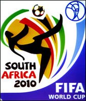
 Talk about design by committee. Saw this over at Adfreak yesterday. Sufficiently generic, like most corporate design. (Ok, that was me trying to be nice.) Suffice it to say that while you’re over there, you’d be better off looking at the picture of the naked granny Tim posted. I’ll leave it at that.
You’re free to go.
Tags: advertising, World Cup, brands

3 comments:
Pretty lame, yeah.
A giant red card would have been a better choice. (Kidding!)
Why does the World Cup always have the worst logos?
I think you should re-title the post to read, “Third World-designed World Cup Logo.”
Post a Comment