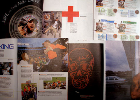
 Regardless of how I feel about the ESPN anchors being apologists for every troubled athlete out there, I gotta give props to the layout and design of ESPN the mag.
If you ever had to produce editorial content on a deadline for a publication, you know what a challenge it can be. Most mags stay with one format for a while, and swap out new stories. From a design POV, The Mag always seems to have a new style for each article in every issue.
Little things most people may not notice, (like developing intricate charts and graphics for each of the pro teams across all the pro leagues). The photography is contemporary too. Major respect to Iooss who set the standard with Sports Illustrated, but by comparison, SI now feels like ABC’s Wide World of Sports to ESPN the mag’s, well, ESPN.) Sports metaphor warning:
They may not hit a home run every issue, but they’re pretty damn close.
Tags: advertising, ESPN the Magazine, brands
1 comment:
Agreed. ESPN the magazine also demonstrates generational differences. Sports Illustrated continues to present material in a dated and stodgy style. ESPN recognizes the importance of design and art direction. People are less interested in reading columns of copy. Pictures and graphics tell stories as strongly as type. Adfolks can learn as much about design and creativity from ESPN as they can from CA or other graphics publications. Probably more.
Post a Comment