 Oh sure Cooper Black is the hero font of the moment in the current mix & match design frenzy of grabbing styles from multiple decades, but don’t let’s not forget about Eras. Even Lubalin is getting love recently in the AMC promo work and on various posters. When it came to the 80s though, nothing said progress, moving forward and bank loans like ITC Eras. Did someone say Crillee? Yeah, you did. Or maybe a nice Adobe Garamond—condensed. Apple Nation would expect nothing less. Or, wait for it ... Broadway. Crockett and Tubbs with Futura? Doubt it.
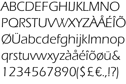
Cooper, you’re going down.
Tags: 80s fonts
3 comments:
But helvetica will always have my heart.
The time for the Eras revival is NOW.
Albert Boton rocks!
Jeez, I better break out the vintage U&LC magazines and bone up. What was the fucking deal with Copperplate and Bank Gothic?
Post a Comment